¶ Introduction
This guide is a simplified version of the official manual.
Whenever feasible, I’ve added brief summaries throughout this guide. They will look something like this:
¶ Summary
- This is a summary!
Finally, if you’ve been following this page’s development, then you can see the changelog here!
¶ What is it? Who is it for?
Sleep Chart is a feature that comes with the SuperMemo software. As the name indicates, it is used to record your sleep.
Sleep Chart is for anyone who has ever searched up online or thought about something along the lines of:
- When is the best time for studying?
- When should I go to bed?
- When should I wake up?
- Should I take a nap? If so, when?
To answer these questions as accurately as possible, the user must have sufficient data.
Furthermore, please take time to read the following disclaimer from the official manual, written by Dr. Piotr Wozniak:
Important! Your natural instinct should always take precedence over mathematical models. Moreover, best results in sleep optimization are accomplished in free-running sleep. If you use an alarm clock, or force yourself awake through the night, or take sleeping pills, the models may not adequately account for the chaotic change that is occurring in your sleep control systems.
¶ How to access it
Accessing Sleep Chart can be done via three ways:
- Press the F12 button on your keyboard.
- Press Ctrl+Enter which will bring up SuperMemo Commander. Then begin to type in the word “sleep chart” until you see it appear on the menu. Once it appears, press Enter.
- Toolkit > Sleep Chart from the main menu that is on the top (a.k.a menu bar).
¶ Timeline tab
Once you launch Sleep Chart, you will see an empty timeline which would look like this:

To make it easier to understand what the buttons are, the image above has been annotated. It will also serve as a point of reference in the future.
To log a sleep block, follow the instructions below (which were taken from the official manual):
To log a block of sleep, click the beginning of the block (sleep start) and then click the end of the block (sleep end). You can also start from clicking the end of sleep first. Sleep blocks above 22 hours are disallowed. Sleep blocks cannot overlap with repetitions timeline (you cannot learn with SuperMemo and be asleep at the same time).
From the annotated screenshot above, we can see that the timeline has a bunch of buttons. Let’s take a look at each one individually. The only buttons that don’t need to be explained are:
- Tabs: These contain different analytical graphs which we will have a look at later.
- Menu bar: You can read about the different options on here.
- Send to SuperMemo R&D
- Go to a specific day on the timeline
- Save current timeline file
- Open a new timeline file
- I’ve added a green box to the bottom-left corner of the annotated screenshot. The cursor’s position is displayed in this box. You’ll notice that the time and dates change as you move your pointer around the timeline. Give it a go! We can also see that there is an extra value at the bottom-left corner of the filled timeline below:
(length=04:10). This displays the length of the sleep block where the pointer is now located.
¶ Sample timeline
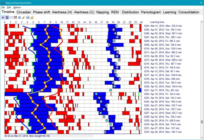
Before we explain what each of the buttons do, let’s have a look at the filled example above (taken from the official manual).
We can see the following:
- Blue blocks.
- Red blocks.
- Blocks that fade from black to blue.
- Blocks that fade from blue to pink.
Great! But what do they mean?!
- Blue blocks represent sleep episodes.
- Red blocks represents learning time. When you use SuperMemo, Sleep Chart keeps track of the time you spend working and generates these blocks. These are collection-specific blocks (in other words, each collection will show these blocks differently, depending on how much you work with each of these collections).
- Blue to pink blocks represent interrupted sleep (e.g., by your alarm clock). You can achieve this by pressing Ctrl+A on a sleep block. You can also achieve the same thing by right-clicking on a sleep block and selecting “Forced awakening”.
- Black to blue blocks represent delayed sleep (things such “falling asleep whilst watching TV” and “you did not go to sleep because you were working” are considered to be delayed sleep). You can achieve this by pressing Ctrl+D on a sleep block. You can also achieve the same thing by right-clicking on a sleep block and selecting “Delayed retirement”.
¶ Summary:
- Blue blocks = sleep.
- Red blocks = time spent studying with SuperMemo.
- Blue to pink blocks = interrupted sleep. Use Ctrl+A to mark a sleep block as interrupted.
- Black to blue blocks = delayed sleep. Use Ctrl+D to mark a sleep block as delayed.
¶ Consolidate
The “Consolidate” button unifies sleep blocks that have a small empty gap in between. Let’s say you have a small 10-minute gap between two sleep blocks, pressing this button gets rid of this gap:

Why might you have a small 10-minute gap between sleep blocks? Many reasons. Let’s say that you woke up in the middle of the night to drink some water, and then you went back to sleep after 10 minutes. Now, your sleep has been split into two blue blocks: the first block representing the sleep time before drinking water, and the second representing the sleep time after you drank water. These two sleep blocks will be separated by a small 10-minute gap (which represents the time you took to drink water and return to bed).
¶ Re-compute circadian approximations
As you may have noticed, the filled timeline has some extra detail which your current timeline may not have. I’m referring to the following:
- Yellow line with circles
- Blue line
- Red line
- Aqua dots
You can enable those by pressing the “Re-compute circadian approximations” button.
Once you press it, these lines and circles will appear. Now, let’s have a look at what they mean:
- Blue line: This line shows you when it is best to go to bed.
- Red line. This line shows you when it is best to wake up (naturally, without an alarm).
- Yellow line: This line should fall approximately in the middle of each sleep block, and it shows the “maximum of circadian sleepiness”.
- Aqua dots: These dots predict the dip in you alertness levels during the day. They can be used to figure out the optimal nap time.
¶ Summary:
- Blue line = predicted bedtime.
- Red line = predicted wake-up time.
- Aqua dots = predicted nap time.
¶ Show time block data
Now you may be thinking “How am I supposed to tell what time I should be going to bed if the lines are a little squiggly?”
Well, don’t worry, Sleep Chart will save you from squinting at your screen trying to figure out whether the line is at 01:15 or 01:16…
How? Press the “Show time block data” button. Now pick a blue block by simply pressing on it (which will make it turn yellow)!
A new menu on the right side of the window will appear (replacing the current Statistics Pane). This menu should contain two headings, BLOCK DATA and OPTIMUM HOURS.
You will notice that in the example below I have pressed the Re-compute circadian approximations button. This is not required. I am doing it to demonstrate and explain the features. I have also added the red and black arrows. These will be explained later.

¶ BLOCK DATA
Under this heading, you will find various pieces of information regarding the selected block:
- Day: This tells you the day number ever since you started logging your sleep. The first sleep block which you recorded will be Day=1.
- Date: This displays the date at which the sleep block has started. So, the example above is showing that this sleep block has started on the Friday, 2nd of July, 2021.
- Block: This shows the start and finish time of the block. This particular sleep block has started at 00:51 (bedtime) and ended at 07:57 (wake-up time).
- Length: This displays the length of the sleep block. So, the one above has lasted for 7 hours, and 6 minutes.
¶ OPTIMUM HOURS
This is the one that will provide an answer to the question we posed before: “How am I supposed to tell what time I should be going to bed if the lines are a little squiggly?”
- Today: This tells you when you should go to bed and when you should wake up. In this example, this Sleep Chart function has given us the exact position of the blue line, which is 01:18. This function has also given us the exact position of the red line, which is 08:07. As we explained in the section above: blue line means bedtime and red line means wake-up time. I have used the red arrows in the screenshot above to help you understand this further.
- Tomorrow: This shows the exact same thing as Today, except it shows the optimum bedtime and wake-up time for tomorrow. I have used the black arrows in the screenshot above to help you understand this further.
- Sleep length: This is the recommended sleep duration based on the hours shown above. So, the change in ideal sleep length between Today and Tomorrow is shown as
06:48 -> 06:52. You can skip the next sentence as it’s there for context. Subtracting the hours supplied in Today yields the optimum amount of sleep hours for today:08:07 - 01:18 = 06:48. The same is true for Tomorrow:07:47 - 00:56 = 06:51.
¶ Statistics Pane
There is a pane on the right side of the window, as seen in the annotated screenshot. Let’s call it the Statistics Pane (though it is worth mentioning that this is not the official name).
This pane displays various statistics about the individual days. You can cycle through these options by pressing Ctrl+Right and Ctrl+Left. The statistics are fairly self-explanatory, and hence we will not go through them in detail for now.
You can also click on Options from the Menu bar, then choose Statistics.
¶ Circadian tab
This tab gives you a greater insight into your sleep time. According to Dr. Piotr Wozniak: “you will need a couple of months of data before this graph becomes meaningful.”
There are two graph views in this tab: Hours from arising and Clock time.
¶ Hours from arising
This is the default view. The annotated screenshot below shows you what this view is like. It also introduces you to the new buttons:
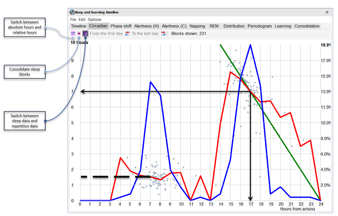
First of all, let’s see what the above is showing, and then we will have a look at some sample data interpretation:
- Left vertical axis shows the sleep length.
- Right vertical axis shows the “percentage of sleep episodes initiated at any given time”.
- Horizontal axis could be interpreted in two ways (depending on whether or not you click the “Switch between absolute hours and relative hours” button). The example above is showing hours from arising. So, the number 0 on the horizontal axis is referring to the waking hour. If you press the previously mentioned button, you will notice three things: first, the graph will change dramatically, and second, the horizontal axis will now read “Clock time” (24-hour clock). Finally, you will notice that the green line has disappeared.
- The little light blue dots represent the sleep blocks we talked about in the section above. So, each light blue dot represents a sleep episode.
- Blue line represents the bedtime frequency. The higher is the peak, the more frequent is the bedtime. Use the right vertical axis to determine the value of this line.
- Red line represents the average sleep length. Use the left vertical axis to determine the value of this line.
- Green line splits the graph into two sections, phase advanced (right) and phase delays (left). The way this line works is by following light blue dots where the waking time (horizontal axis) and the sleep time (left vertical axis) add up to 24 hours.
- Green line crossing the red line shows the “optimum balanced sleep cycle of 24 hours”.
¶ Summary:
- Left vertical axis = sleep length.
- Right vertical axis = percentage of sleep episodes initiated at any given time.
- Horizontal axis = relative/absolute hours.
- Light blue dots = sleep blocks we talked about in the section above.
- Blue line = bedtime frequency. Use the right vertical axis to determine the value of this line.
- Red line = average sleep length. Use the left vertical axis to determine the value of this line.
- Green line = separates the graph into two sections: phase advanced (right) and phase delays (left).
- Green line crossing the red line = “optimum balanced sleep cycle of 24 hours”.
¶ Sample data interpretation (Hours from arising)
From the screenshot above, we can infer the following:
- Most frequent bedtime occurs after 17 hours from arising (because that’s where the SECOND peak (from the left) of the blue line occurs). In fact, 19.9% of the sleep episodes have occurred after 17 hours from arising (we used the right vertical axis to determine this value).
- Most frequent nap time occurs after 7 hours from arising (because that’s where the FIRST peak (from the left) of the blue line occurs).
- On average, the naps last for about 1 hour and 30 minutes (because the red line is around this area. See the black dashed line which I added to the screenshot above).
- In this example, 17 hours from arising, the user is expected to sleep for 7 hours (because that’s where the green line crosses the red line. See the two black arrows which I added to the screenshot above). Also notice that 17 hours plus 7 hours is equal to 24 hours!
¶ Clock time
Now, you might be thinking “The Circadian tab is awesome, but figuring out the most frequent bedtime on a 24-hour clock using the ‘hours from arising’ method is a little challenging.”
Fear not, Sleep Chart has got you covered! Click the “Switch between absolute and relative hours” button to get the Clock time graph. Again, we will have a look at some sample data interpretation after discussing the screenshot below:
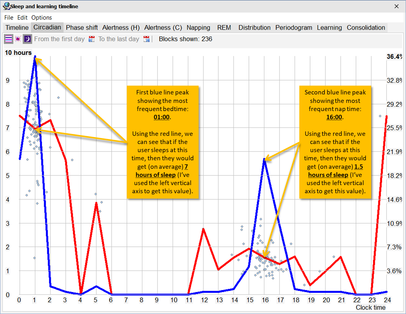
As we discussed earlier, the horizontal axis can be interpreted in two ways: absolute and relative hours. And as we saw earlier, pressing the “Switch between absolute and relative hours” button changes the graph dramatically by:
- Shifting the blue line and the red line.
- Switching horizontal axis from “Hours from arising” to “Clock time”.
- Removing the green line.
Other than those changes outlined above, everything else is still the same: the blue line still means “bedtime frequency”, and the red line still means “average sleep length”.
¶ Sample data interpretation (Clock time)
From the screenshot above, we can infer the following:
- Most frequent bedtime occurs at 01:00 (because that’s where the FIRST peak (from the left) of the blue line occurs). In fact, 36.4% of the sleep episodes have occurred at this time (we used the right vertical axis to determine this value).
- If the user sleeps at this most frequent bedtime, they would get (on average) 7 hours of sleep (because the red line is around this area).
- Most frequent nap time occurs at 16:00 (because that’s where the SECOND peak (from the left) of the blue line occurs).
- Once again, on average, the naps last for about 1 hour and 30 minutes (because the red line is around this area).
¶ Learning Circadian Cycle
We’ve discussed sleep exhaustively. Let’s now turn our attention to something equally vital: learning.
As you may recall, there were some red blocks present in the timeline tab. We learned that these blocks represent time spent studying with SuperMemo.
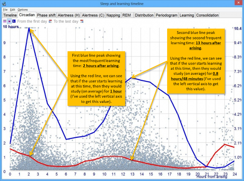
These blocks are also represented by a graph to help you spot trends and, hence, determine the best time to learn. Simply click the “Switch between sleep data and repetition data” button to get this graph!
The interpretation of the blue line, red line, and the 3 axes is exactly the same as before. Therefore, we will not go through them again now.
In case you still require some extra guidance, I have annotated the graph below:
¶ Phase shift tab
People with Advanced Sleep Phase Disorder (ASPD) and Delayed Sleep Phase Disorder (DSPD) might benefit from this tab. However, you can still use it to work out the “expected bedtime given a specific natural waking time.”
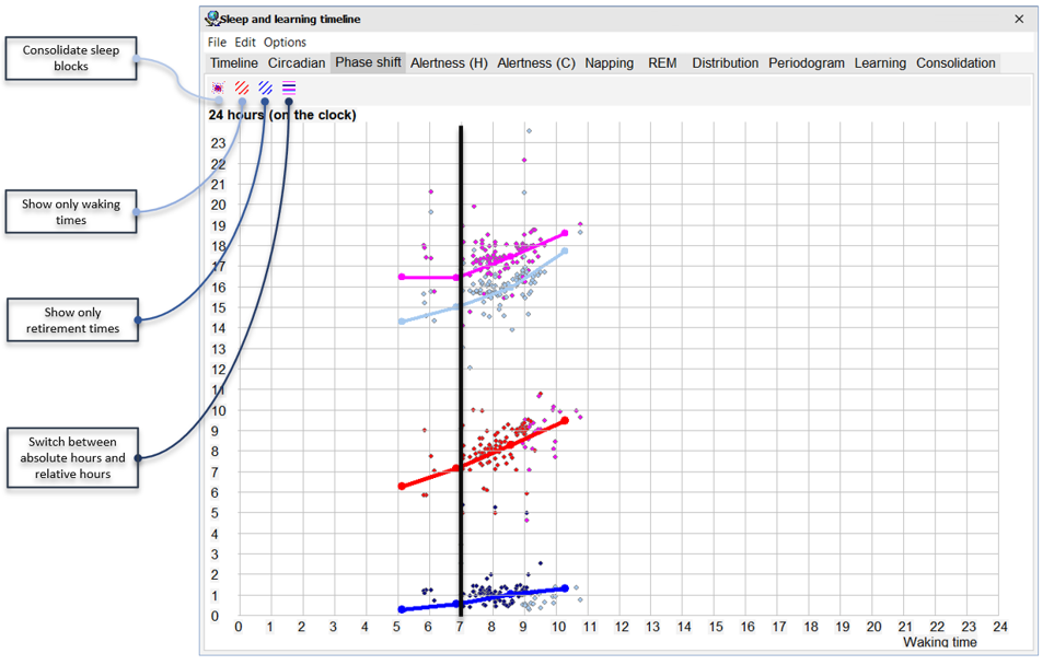
As usual, let’s dissect the graph above before having a look at some sample data interpretation:
- Left vertical axis shows the bedtime hours. And, just like in the horizontal axis in the Circadian tab, this axis has two options (which can be modified using the “Switch between absolute hours and relative hours” button): hours from arising and clock time.
- Horizontal axis shows the natural waking hour (24-hour clock).
- Blue line shows “the bedtime for days with a given waking hour.” Use the left vertical axis to determine the value of this line.
- Red line shows the “next day’s waking hours.” Use the horizontal axis to determine the value of this line.
- Fuchsia line and gray line show the siesta/nap period.
¶ Sample data interpretation (Phase shift tab)
Here’s a free tip from me to you: the simplest way to interpret this graph is to begin with the horizontal axis.
Please keep in mind that these are only estimates, not recommendations. If the value provided by Sleep Chart appears to be absurd, then apply your judgement and trust your natural instincts (i.e., you must go to sleep if you feel tired). Furthermore, as it has been previously indicated, the graphs are only accurate if you free-run your sleep.
Let’s have a look at the annotated screenshot above. If the user wakes up at 07:00 (horizontal axis), then:
- Using the blue line, we can see that their bedtime will occur at around 00:30 (vertical axis).
- Using the red line, we can see that the user will wake up at around 07:10 the next day.
- Using the fuchsia line and gray line, we can see that the expected nap period for that given hour is between 15:00 (gray line) and 16:30 (fuchsia line).
¶ Alertness tab
Before we get started, I should tell you that things are going to become wild. I personally struggled to grasp this topic in such a short amount of time, and as a result, I fear that I may provide you with incorrect information. However, I intend to return to this article (when I have more free time) to double-check that everything is correct. So, I advise you that you refer to official manual just to be safe!
So, without further ado, let’s get down to business.
To fully comprehend this tab, you must first understand two key sleep principles. These are the components of sleep:
- Homeostatic component: the more we stay awake, the sleepier we get.
- Circadian component: sleep is a 24-hour cycle, which peaks and troughs. The word “circadian” comes from the Latin “circa diem”, which means “around a day.”
You got all that? Cool.
Simply said, “alertness” in SuperMemo refers to “how alert you are when studying.” This is calculated using the average grade in learning with SuperMemo, according to Dr. Wozniak. So, if you get better grades in the morning and worse grades in the evening, it’s likely that you’re more alert in the morning.
For the keen-eyed among you, you may have noticed that there are TWO Alertness tabs: Alertness (H) and Alertness (C). You’ve probably figured it out by now.
Alertness (H): this is the homeostatic alertness, which is a measurement of alertness since that last sleep episode.
Alertness (C): this is the circadian alertness, which is a measurement of alertness with respect to the circadian time (i.e., “time measured since the optimum natural waking hour”). This is a little trickier to understand, I know.
I have asked for a better explanation of the differences between the two, and here is the response that I got:
Alertness can be studied in reference to homeostatic (H) and circadian (C) variables, however, those variables cannot be easily disentangled. High alertness is the effect of maximum circadian alertness and minimum homeostatic fatigue. That state can be safely marked as the state that maximizes alertness for both variables. This state should characterize early morning in a healthy sleep cycle. However, low alertness may be caused by changes in any of the alertness variables. When both H and C variables show alertness minima, natural sleep occurs.
Circadian alertness shows how alertness changes during a waking day. It is plotted against the waking time.
Homeostatic alertness cannot be separated from circadian variables except for a short period after waking when it declines exponentially.
This is why homeostatic alertness plotted against waking day that is not interrupted by sleep is the closes approximation of homeostatic drop in mental efficiency.
In non-nappers the graphs may turn out similar as the homeostatic curve may span beyond the circadian dip in alertness followed by seeming “recovery”.
https://supermemo.guru/wiki/Sleep_and_learning#Alertness_multiplier
Every sleep episode ends with waking (naturally), but “last sleep episode” refers to the episode before a longer waking time (e.g. subjective day). The end of the episode may then mark the start of collecting data for measuring homeostatic alertness.
I also got a better definition of the terms “natural waking hour” and “last sleep episode”:
Waking time is the time of waking up. If you wake up and look at the clock, and it is 9:11, you can say this is your waking time. This may differ from expected natural waking time that depends on the circadian cycle.
Sleep episode is a single block of sleep marked by waking time before and after. A sleep episode may be shorter than night sleep. For example, if you wake up at 4:20 am to visit the toilet, your sleep episodes might be 23:23-4:20 and 4:26-7:46.
¶ Napping tab
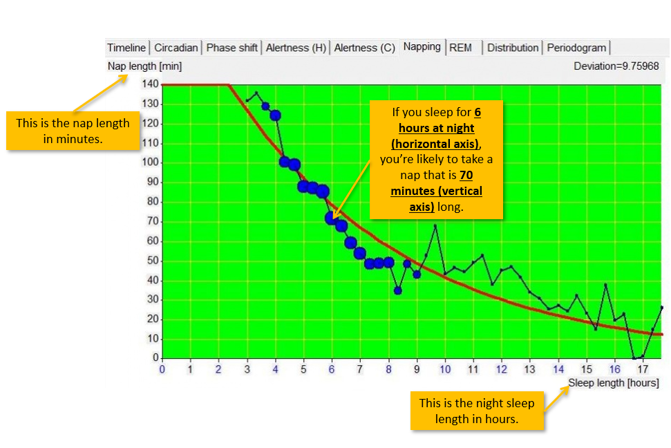
As the name suggests, this tab is for the napping graphs. According to Dr. Wozniak, if your night sleep is shortened, you tend to compensate with naps.
Have a look at the screenshot below. I have annotated and explained it.
Note: The size of the blue dots reflects how much information is available. As a result, the larger the dot, the more data is collected, and thus the plot is more accurate.
¶ Learning tab
In this tab, you can have a look at the correlation between your sleep and the number of learning hours.
Furthermore, there are 2 modes to this graph. The second mode can be activated by left clicking the graph once (to revert back to mode 1, you need to switch to another tab).
As you can see, in mode 1 (the default), there is a mathematical formula at the top of the graph. You can plug some numbers in, and work out a value.
Although the documentation is not entirely clear on how to use this graph, I have posted a question on SuperMemopedia to see if additional data can be provided.
However, from what I gather, it is pretty straight forward.
¶ Mode 1
In this mode, you can take a look at the amount of learning vs. amount of sleep.

¶ Mode 2
You can display this graph by left clicking the graph once (to revert back to mode 1, you need to switch to another tab and then come back).
SuperMemo Sleep Chart is smart. It can count how many hours of sleep you had in the last 20 hours (so, this includes your night sleep and any naps that you may have had). Then, it can create a curve to illustrate the association between this AND the quantity of sleep that your subsequent sleep episode is anticipated to bring about.
Here is some text from a conversation I had with Dr. Wozniak regarding the interpretation of this graph:
Me: In the first link you posted, there is the following image. Am I right in saying the following:
- If you slept for 4 hours (horizontal axis) in the previous 20 hours, this means that you are expected to sleep for 5 hours in the following night (vertical axis)
Dr. Wozniak: “you are expected to sleep for 5 hours in the following night” is imprecise. More likely you should say, “you are expected to sleep for 5 hours on average” (perhaps 3 hours one day, and 10 hours the other day, depending on how regular your schedule is).

¶ Consolidation tab
This tab maps consolidation against recall. In SuperMemo, consolidation simply means the outcome of the review. Consolidation is the “average grade scored in the next repetition.” Another good definition is (from SuperMemo Help):
Consolidation: retention of material repeated on a given day D as measured on the days of successive repetitions of individual elements. Both retention and consolidation are displayed in Toolkit : Calendar under Retention. Calendar displays these values as <retention> -> <consolidation>. If you are sleepy or tired on the day D, your retention will be poor, even if your memories are strong. In other words, measured retention is not an ideal reflection of memory retrievability. Consolidation is not measured on a single day. The measurements are gradually added up on days on which successive repetitions of the material repeated on the day D take place. Consequently, consolidation is less dependent on the variability in your recall readiness. At the same time, being tired or sleepy on the day D can affect the consolidation of the material. It is retention that is less dependent on the variability in your consolidation readiness.
One thing to note about this tab is that you need to spend a lot of time in SuperMemo, and you need to review a lot of stuff. You also need to have used SuperMemo for a long period of time (years). Otherwise, the graph will be empty/inaccurate.
At the moment, I don’t have any good screenshots for this tab. If you like, you can send me a screenshot of yours, and (with your permission), I can annotate it!
The tab is pretty self-explanatory. The horizontal axis represents the % recall and the % consolidation.
¶ Two-component sleep model
SuperMemo predicts the homeostatic and circadian status of overall sleep propensity (i.e., how sleepy you feel) based on the user’s sleep data. This is, without a doubt, my favourite Sleep Chart feature. It’s something I use on a daily basis.
To access this graph (faster):
- Hold Shift on your keyboard and press on a day row in the Timeline tab
Another way to access this graph:
- Right click on a sleep block in the Timeline tab
- Select “Sleep propensity” (you can also use Ctrl+P)
You will notice that there are many lines on this graph. I, personally, only use 2 of them: the red line and the aqua line. These two are the ones which provide the most useful/interesting information.

¶ Summary
- Blue blocks = actual sleep episodes (see Sample timeline for more information about these blocks).
- Aqua line = 24-hour circadian sleep propensity. The peaks mean that you are more sleepy, and thus, a nap is good idea. If you remember, the aqua dots that we talked about in the Re-compute circadian approximations section above predicted the nap time. Now, the peak of this aqua line represents the aqua dots.
- In short: peak of aqua line = aqua dot on Timeline tab = predicted optimum nap time.
- Green line = an inverse of the homeostatic sleep propensity
- Yellow vertical lines = circadian middle-of-the-night peak. I believe that this represents the Yellow lines in Timeline tab (see Re-compute circadian approximations section for more information).
- Red line = resultant alertness. The higher the peak, the more alert you are predicted to be.
- Vertical fuchsia line = marks the 24th hour (i.e., the end of the day/start of a new day)
¶ Changelog
¶ 25th of December, 2022 (Merry Christmas and Happy Holidays!)
- This page has been completed. I’ll make an effort to go over it again occasionally to make sure everything is clear and concise. Do not hesitate to get in touch if you have any questions!
- This is my present to the community; I’m grateful to everyone who assisted. Thank you for Dr. Wozniak for writing such detailed documentations, I had a great time reading it. A massive thank you to Alexis for creating and hosting this website.
¶ 29th of April, 2022
- Updated Alertness tab section (it’s still a work-in-progress).
- Added Two-component sleep model tab.
- Added Learning tab (it’s still a work-in-progress).
- Added Consolidation tab (it’s still a work-in-progress).
- Other edits
¶ 14th of February, 2022
- I have not abandoned the article, I promise!
- Added the Alertness tab section (it’s still a work-in-progress).
- Added the Napping tab section
¶ 20th of August, 2021
- Added Phase shift tab section and added a picture
- Updated the meaning of the term “delayed retirement” (again…)
¶ 3rd of August, 2021
- Updated the meaning of the term “delayed retirement”
- Added some more information to Learning Circadian Cycle section
- Added picture to Learning Circadian Cycle section
- Updated the summary for Re-compute circadian approximations section
¶ 1st of August, 2021
- Updated the picture used in Clock time section
- Added Learning Circadian Cycle section
- Other edits